


UNAM 2026 Control Exam in data: demand, scores, anomalies, and what the results really reveal
Arcadia analyzes the UNAM 2026 Control Exam to understand what happened beyond the selected list: thousands of applicants, marked differences between campuses, changes in effective competition, and a process shaped by questions left by the original online application.
By Arcadia Data analysis | Education | UNAM 2026
The 2026 undergraduate admissions process at the National Autonomous University of Mexico (UNAM) cannot be understood by looking only at a list of selected applicants. This year, the online exam, irregularities detected during some assessments, and the later introduction of an in-person Control Exam changed how the process must be read. What could once be summarized as applicants, correct answers, and available places became a more complex combination of registrations, actual examinees, campus differences, validation criteria, and results that require context before they can support a conclusion.
Arcadia reviewed the information collected and processed by Inclick for the UNAM 2026 process, including registered applicants, people who sat the exam, selected applicants, degree, campus, stated offer, and minimum correct answers. The goal is not only to identify the most demanded degree or the highest cutoff, but to understand what changes when campuses are grouped, how many people registered but did not sit the exam, how much the same degree can vary by location, and where the records contain differences that need to be interpreted carefully.
The interactive data are available in Inclick’s Control Exam panel.
An unusual admissions process
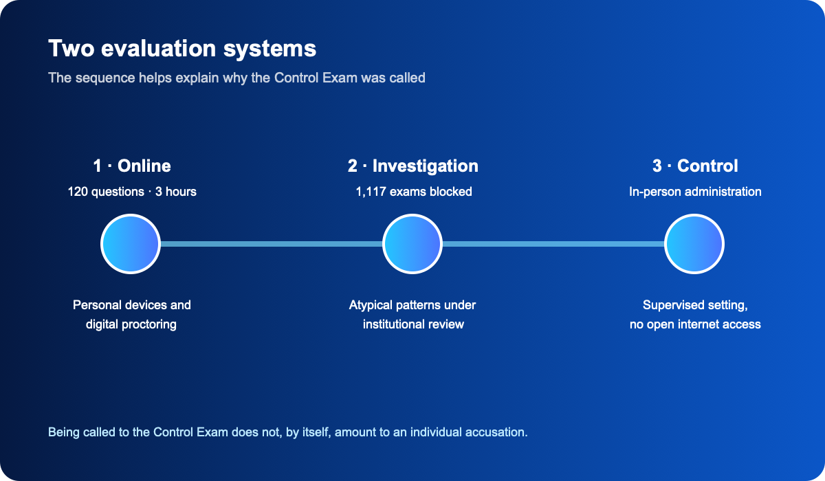
The UNAM 2026 process was different from its design onward. The selection exam was initially administered online, with 120 questions and a maximum time of three hours, using technological monitoring and specific restrictions intended to create comparable conditions. Unlike a traditional in-person exam—with a controlled physical space, supervisors, and a relatively uniform environment—the remote model moved much of the control to software, personal devices, connectivity, and monitoring systems.
Incidents began to appear during the application. The University itself reported that it had blocked 1,117 exams while investigating behavior patterns considered atypical. That figure matters because it confirms that conduct contrary to the rules occurred within the process, but it also demands care in interpretation. Irregularities do not mean that every high score was fraudulent, nor that every person later called to the Control Exam had been accused of cheating.
Public discussion tended to simplify the issue by treating the Control Exam as merely a second test for suspected applicants. In practice, the criteria were broader. In addition to certain applicants initially selected, people could be called because they had reached performance levels equal to or above historical minimums established for the same degree, campus, location, and modality. Being called to the Control Exam therefore does not, by itself, amount to an accusation of irregular conduct.
The Control Exam changed the evaluation conditions completely
The difference between the original exam and the Control Exam was substantial. The first took place remotely, using personal equipment and digital surveillance. The second moved to a physical setting, with devices intended specifically for the assessment, no open internet access, and in-person supervision. Although both retained a structure of 120 questions and three hours, the application environment was radically different.
This makes the 2026 process especially interesting from a data perspective. It is not only a comparison between two exams, but between two evaluation systems. In one, control depends mainly on technological tools applied at a distance; in the other, control is concentrated again in a supervised institutional setting. That difference matters because a high-stakes assessment is determined not only by its questions, but also by how identity, surroundings, access to outside information, devices, and subsequent auditing are managed.
What are we actually analyzing?
The records processed by Inclick make it possible to examine each degree–campus combination through variables such as academic area, offer, applicants, examinees, minimum correct answers, and selected applicants. This structure provides a much richer reading, but it also requires distinctions between concepts that are often treated as interchangeable.
For example, when someone asks which degree was most demanded, there are at least two valid answers. We can identify the individual degree–campus combination with the most applicants, or group all campuses where the same degree is offered. Both measurements are correct, but they tell different stories. That difference is one of the first things the data make visible.
Law is one of the major demand centers
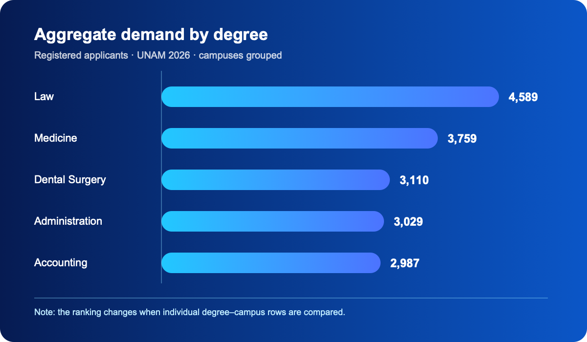
When the campuses listed for Law are grouped together, the degree reaches 4,589 applicants. The observed distribution is:
- Faculty of Law: 2,129 applicants
- FES Aragón: 1,437
- FES Acatlán: 944
- ENES Morelia: 79
Grouped this way, Law exceeds other degrees with very high aggregate demand, including Medicine with approximately 3,759 applicants, Dentistry with 3,110, Administration with 3,029, and Accounting with 2,987.
However, if we compare only the individual degree–campus combination with the most applicants, Administration at the Faculty of Accounting and Administration records 2,144 applicants, while Law at the Faculty of Law records 2,129. The difference is only 15 people. A ranking based on individual rows can therefore put Administration first, while an aggregate ranking can put Law first.
The conclusion is simple: saying that a degree is “the most demanded” without explaining the method can be technically correct and still incomplete.
Registered applicants are not the same as effective competition
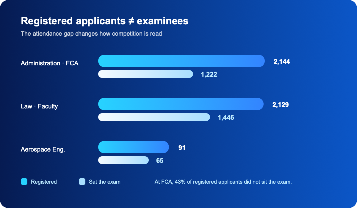
One of the most important findings appears when registered applicants are compared with people who actually sat the exam. Administration at the Faculty of Accounting and Administration is a clear example: it registered 2,144 applicants, but only 1,222 took the exam. The difference is 922 people, or approximately 43% of those registered.
That figure changes the initial impression completely. If we look only at applicants, we might imagine more than two thousand people directly competing for the option. The group that actually took the exam was much smaller. Law shows a different pattern: the Faculty of Law registered 2,129 applicants, almost the same number as Administration, but 1,446 sat the exam. In terms of effective participation, Law exceeds Administration by 224 examinees.
This shows that registered demand and actual competition are not the same. The gap can result from many factors: people leaving the process, changing their decision, administrative problems, difficulty participating, or features of this extraordinary process. The data cannot assign a single cause, but they do show that absences materially change the reading of competition.
More applicants do not necessarily mean more correct answers
A common assumption about admission to UNAM is that degrees with more applicants must require more correct answers. The data show a much more complex relationship.
Aerospace Engineering at the Faculty of Engineering recorded 91 applicants, 65 examinees, and a minimum of 96 correct answers. By contrast, Administration at FCA had 2,144 applicants and a cutoff of 67. Medicine at the Faculty of Medicine had 1,718 applicants and a cutoff of 92, while Actuarial Science at the Faculty of Sciences recorded 389 applicants and also reached 92 correct answers.
This separates two concepts that are often mixed together: popularity and admission difficulty. Applicant volume matters, but so do the number of places, the performance of the group that sits the exam, and the distribution of scores. A relatively small degree can end up with a very high cutoff when its competitors score highly and available places are limited.
Aerospace Engineering: a particularly revealing case
The Aerospace Engineering case summarizes this logic well. The row shows 13 places in the offer column, 91 applicants, 65 examinees, 96 minimum correct answers, and 26 selected applicants. The first striking fact is the cutoff: 96 out of 120 correct answers represents about 80% of the exam.
What makes it interesting is that this level does not appear in a degree with thousands of applicants, but in a comparatively small option. Speaking of “the most difficult degree” solely by the number of interested people can therefore lead to the wrong conclusion. Here, the observed academic competition was especially high even though absolute demand was much lower.
The campus can change dozens of correct answers
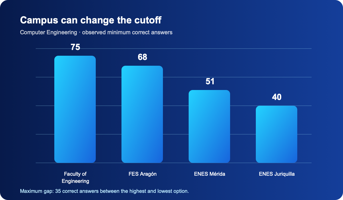
Another useful point for future applicants is the enormous difference between campuses offering the same degree. Computer Engineering is one of the clearest examples: the Faculty of Engineering recorded 75 minimum correct answers, FES Aragón 68, ENES Mérida 51, and ENES Juriquilla 40. The gap between the highest and lowest option is 35 correct answers.
The same pattern appears in other degrees. Law ranges from 65 correct answers at the Faculty of Law to 40 at ENES Morelia. Psychology moves from 74 at the Faculty of Psychology to 45 at ENES Juriquilla. Biology varies from 72 at the Faculty of Sciences to 40 at ENES Mérida. Choosing a campus is therefore not a minor detail: it can radically change the observed level of competition.
This does not mean applicants should choose a degree only by its cutoff. Location, curriculum, commuting, professional profile, and personal circumstances are broader considerations. But ignoring differences of 20, 25, or 35 correct answers means ignoring an important part of how selection actually works.
Law shows how much competition changes by campus
Law is one of the clearest examples. At the Faculty of Law there were 2,129 applicants, 1,446 examinees, 610 selected applicants, and a cutoff of 65. At FES Aragón there were 1,437 applicants, 938 examinees, 575 selected applicants, and a minimum of 49. FES Acatlán recorded 944 applicants, 657 examinees, 483 selected applicants, and a cutoff of 46, while ENES Morelia recorded 79 applicants, 48 examinees, 45 selected applicants, and a minimum of 40.
If selected applicants are calculated against all applicants, the observed rates are approximately 28.7% at the Faculty of Law, 40.0% in Aragón, 51.2% in Acatlán, and 57.0% in Morelia. If we use only people who sat the exam, the proportions become 42.2%, 61.3%, 73.5%, and 93.8%, respectively.
This reveals another recurring problem in educational statistics: an “acceptance rate” means little unless we know its denominator. Selected applicants among all registrants and selected applicants among examinees are different metrics answering different questions.
Medicine tells a different story
Medicine maintains a high level of competition even when the campus changes. The Faculty of Medicine recorded 1,718 applicants, 1,111 examinees, 312 selected applicants, and 92 minimum correct answers. FES Iztacala had 1,264 applicants, 810 examinees, 212 selected applicants, and a cutoff of 84, while FES Zaragoza reached 777 applicants, 473 examinees, 76 selected applicants, and a cutoff of 91.
Together, the three options contain 3,759 applicants, 2,394 examinees, and 600 selected applicants. Considering all registered applicants, approximately 16 out of every 100 were selected in these records.
FES Zaragoza is especially interesting because it had fewer applicants than Iztacala and the Faculty of Medicine, but reached a cutoff of 91 correct answers, only one below the Faculty. Once again, lower absolute demand does not guarantee a lower selection frontier.
The curious behavior of the number 40
The dataset repeatedly shows 40 as the minimum number of correct answers in different options. It appears in programs from multiple academic areas and campuses, especially at some ENES locations and in programs facing lower demand pressure. The concentration is striking because it creates a visible statistical floor in the dataset.
This does not necessarily mean there is a universal rule requiring 40 correct answers. It may be related to administrative criteria, available places, performance levels, or the specific characteristics of each educational option. Still, the pattern deserves attention because it contrasts sharply with degrees whose cutoffs exceeded 80 or 90 correct answers.
There is even an extreme case: Community Development for Aging in Tlaxcala, with one applicant, no examinee, no selected applicant, and a recorded cutoff of zero. Looking only at that last value and saying that “the degree required zero correct answers” would be technically possible but completely misleading. In reality, nobody sat the exam for that degree–campus combination. The record shows why an isolated number can be precise and still tell a false story when its context is removed.
Inconsistencies that still need an explanation
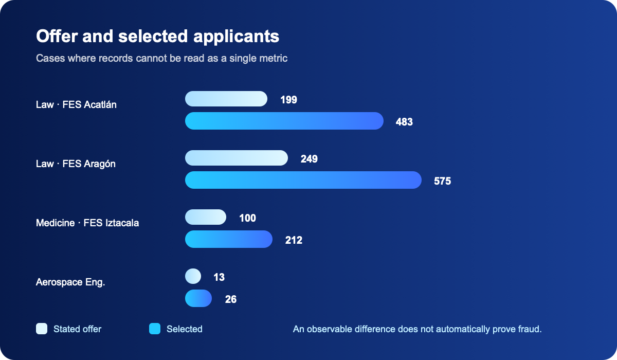
The analysis also reveals differences that should not be ignored. The main one appears when the column labeled Offer is compared with the number of Selected applicants. In several options, selected applicants substantially exceed the stated offer.
Examples include:
- Law at FES Acatlán: 199 places offered and 483 selected applicants
- Law at FES Aragón: 249 places offered and 575 selected applicants
- Medicine at FES Iztacala: 100 places offered and 212 selected applicants
- Aerospace Engineering: 13 places offered and 26 selected applicants
The gaps are too large to assume a simple explanation. The columns may refer to different moments of the process, different administrative definitions, reallocations, later updates, or misunderstandings in the source. With the information available, it is not responsible to assert what happened.
Arcadia therefore treats these cases as inconsistencies or differences in definition that require additional context, not as automatic evidence of manipulation. A data anomaly is not the same as fraud. Responsible analysis identifies the difference, flags it, and avoids speculation until enough information is available.
Individual results clarify what a cutoff actually means
Individual records make the selection frontier easier to see. In Actuarial Science at the Faculty of Sciences, the recorded cutoff is 92 correct answers. Among the folios analyzed are results with 91 correct answers that were not selected and results with 92 correct answers that were selected, along with higher scores such as 99, 106, 109, and 111 or more.
This illustrates a basic concept: minimum correct answers are not the average score of those admitted, nor a guaranteed target for future processes. They represent the observed selection boundary for a particular degree and campus. In some cases, a single answer separates two people on opposite sides of that boundary.
A historical cutoff should therefore not be treated as a fixed target. If a degree had a minimum of 75 correct answers in one process, that does not mean 75 will be enough the following year. Cutoffs depend on applicant volume, available places, the performance of the group, and the specific conditions of each call.
Zeros may be affecting the average
Another important methodological issue appears in the individual records, where many results show 0 correct answers. At the same time, aggregated data show that the number of applicants is higher than the number of people who sat the exam. This raises a relevant question: do all those zeros represent examinees who really obtained zero correct answers, or do some represent absences and administrative states?
The distinction is crucial. If a person who did not sit the exam is stored as zero and that value is later included in an average, the final result no longer represents the performance of people who actually took the test. It becomes an average of records rather than an average of examinees.
Any performance analysis should therefore clearly separate registered applicants, examinees, absences, selected applicants, and valid scores. A number can be extremely precise and still answer a poorly defined question.
What the online-exam irregularities really tell us
The discussion of irregularities should not end with the phrase “there was cheating.” The deeper issue is how to guarantee a fair assessment when the physical environment is not fully under institutional control.
Remote administration has important advantages. It can scale, reduce travel, make territorial distribution easier, and lower certain logistical costs. But it also introduces additional risks: personal equipment, home networks, other devices nearby, difficulty verifying the environment, and dependence on automated monitoring systems.
Those systems also have limits. Technology can detect atypical behavior, but it must distinguish it from legitimate situations. A person can move, look away from the screen, lose connectivity, or experience a technical problem without trying to violate the rules. Automated monitoring should therefore not be confused with an automatic verdict.
The challenge is to pursue two objectives at once: make misconduct difficult while preventing legitimate participants from being harmed by systems that are too restrictive or imprecise.
The Control Exam as a second layer of trust
Seen from this perspective, the Control Exam can be understood as a second validation layer within the system. The first assessment prioritized digital scalability; the second restored an in-person, controlled environment. That combination may become an interesting model for future large-scale assessments, although it also creates new costs, administrative complexity, and uncertainty for participants.
Most importantly, the 2026 process requires us to think of the exam as a complete system. Good questions are not enough. Identity, monitoring, infrastructure, privacy, accessibility, security, and auditing mechanisms must also be designed carefully. Digitizing an exam does not eliminate logistics; it changes where the risks occur.
What the data can establish—and what we still do not know
The analysis detects robust patterns, but it also has limits. We can say that there are significant differences between applicants and examinees, that the same degree can vary sharply by campus, that demand and cutoff are not perfectly related, and that certain fields require further explanation.
We cannot use these records to determine individually who committed an irregularity. Nor can we claim that a high score is evidence of fraud, definitively explain the gaps between offer and selected applicants, or assume that every zero represents exactly the same state.
These limits matter. Acknowledging what we do not know does not weaken the analysis; it prevents an observable statistic from becoming a conclusion the data cannot support.
What the UNAM 2026 Control Exam really reveals
After cross-checking the records, several conclusions stand out:
- Demand and difficulty are not synonyms. A degree with few applicants can end up with one of the highest cutoffs.
- Campus matters far more than is usually assumed. In some degrees, changing location means a difference of more than 20 or even 30 correct answers.
- Registered applicants and examinees are different populations. Ignoring absences can distort the perception of competition.
- Rates require a method. Selected applicants among registrants and selected applicants among examinees do not represent the same thing.
- Data require context. Fields such as offer, selected applicants, and zero scores should not be interpreted automatically.
- The digital process is part of the exam. Security, monitoring, identity, connectivity, and auditing affect the reliability of the assessment.
- A historical cutoff is not a promise about the future. Minimum correct answers describe one specific process; they are not a fixed target.
Inclick: turning results into useful information
The purpose of Inclick should not be limited to showing whether a folio was selected. The Control Exam data can support more useful tools for future applicants: comparing degrees, understanding campuses, analyzing cutoffs, distinguishing registrants from examinees, observing trends, and using historical processes to make better-informed decisions.
Educational information has more value when it is not only published but explained. Inclick can continue refining and cross-checking the UNAM 2026 records as new sources, institutional clarifications, and opportunities to correct or contextualize specific entries become available.
The interactive results and analysis for the UNAM 2026 Control Exam are available here:
Methodology and transparency
This analysis was prepared by Arcadia using information collected, structured, and processed by Inclick for the UNAM 2026 admissions process. Groupings, percentages, and comparisons were built from available records for degree, campus, applicants, examinees, selected applicants, offer, and minimum correct answers.
When degrees are grouped, the campuses listed under the same degree name are considered together. When selection rates are calculated, total registered applicants are kept separate from people who actually sat the exam because the two metrics answer different questions.
The inconsistencies identified in this article are not accusations of fraud, manipulation, or misconduct. They are observable differences in the records that require additional information to be explained with certainty.
References to irregularities during the online exam correspond to information publicly communicated about the process. No statistical analysis presented here is intended to identify individuals who may have acted contrary to the rules.
The data may continue to change as new sources are published, records are cleaned, or additional institutional information becomes available.
How to read the table without overclaiming
The safest way to use an admissions table is to begin with the definition of every column. “Registered” describes people who started or completed the application; “examinees” describes people who actually took the assessment; “selected” identifies the published outcome for that option; and “minimum correct answers” summarizes the observed boundary between selected and non-selected applicants for that degree–campus combination. These populations are related, but they are not interchangeable.
That distinction matters whenever a percentage is calculated. Dividing selected applicants by registrants produces a broad measure of conversion across the whole process. Dividing selected applicants by examinees is closer to the proportion of people who competed on exam day. Neither rate is the single “true” rate: each answers a different question. The mistake is presenting one without naming its denominator.
It is equally important to separate an observation from an explanation. The table can show that one campus has a cutoff 35 correct answers higher than another, or that selected applicants exceed the stated offer. It can show that a large share of registrants did not sit the exam. Without additional variables, however, it cannot say whether the difference reflects mobility, preferences, reassigned places, administrative updates, technical problems, or a different source definition. Rigorous reading preserves the anomaly and leaves its cause open.
The comparisons in this article should therefore be read as signals for further investigation. The point is not to turn a striking number into a verdict, but to identify the next question: What is the unit of analysis? What is the record date? Does the offer refer to the same stage as selection? Are zeros valid results or absence codes? Is the degree being compared by campus or in aggregate?
A reproducible checklist for the next call
An applicant can turn this analysis into a simple routine for the next admissions call. First, download or preserve the original source together with its consultation date. Admissions data can change as corrections, clarifications, additional lists, or quota adjustments are published. Keeping a copy makes it possible to distinguish a real update from a transcription error.
Next, build one row for every degree–campus–modality–location combination. If a degree appears at four campuses, keep those four rows before creating any sum. A second view can aggregate them by degree name, but the disaggregated view is what reveals that Law in one location and Law in another are not the same competitive environment.
The third step is to calculate three ratios separately: selected applicants over registrants, selected applicants over examinees, and examinees over registrants. The first helps measure conversion from application to selection; the second measures selectivity among people who actually appeared; the third measures participation. To avoid misleading percentages, publish numerator and denominator beside every rate, round conservatively, and flag results with very small denominators.
The fourth step is to inspect the distribution rather than only the minimum. A cutoff of 92 correct answers may hide a group tightly concentrated between 90 and 95 or a broad upper tail. When microdata are available, review the median, quartiles, number of zeros, missing values, and the difference between selected applicants and those just below the cutoff. The distance between the minimum and the average also helps explain why a small program can be extremely demanding.
Finally, record every cleaning decision. If zeros are excluded because they are treated as absences, write down the rule; if campuses are grouped, preserve the list of rows that were summed; and if years are compared, check changes in exam format, modality, number of questions, and reporting conventions. A reproducible analysis should not depend on the memory of the person who prepared it.
What a stronger data release would add
The reviewed dataset already reveals meaningful patterns, but a more complete institutional release could add a data dictionary. For every field, it should state the definition, unit, cutoff date, source, and update rule. “Offer” needs especially precise wording: it could mean initial seats, authorized seats, seats finally available, or a value from a different stage of the process.
A version identifier and a change log would also help. Analysts could then see when a campus was added, a score corrected, or a selected count revised. This does not benefit only researchers. Applicants would have a clear way to understand why a number they saw yesterday no longer matches today’s figure.
Transparency does not require publishing names or complete folio numbers. It is possible to share campus-and-degree aggregates, score ranges, examinee counts, and methodological documentation without exposing personal information. When individual records are released, clear rules should govern anonymization, retention, and correction requests.
A technical note should also describe how blocked exams, Control Exam calls, non-appearances, and zero values were handled. If zero is an administrative code, it must be separated from an actual score. If a record was excluded during validation, the general criterion should be disclosed without identifying the person. Statistical trust depends on these notes as much as on the headline table.
Implications for applicants, institutions, and analysts
For applicants, the practical lesson is to avoid two shortcuts: choosing a degree only because it has many registrants, and studying to hit exactly the historical minimum. A stronger strategy combines the campus history, academic profile, available seats, and a safety margin. The cutoff is a reference, not a promise. Campus choice should also include travel, curriculum, schedule, and the realistic ability to attend.
For the University, the gaps between offer and selected applicants show why every seat figure should be tied to a process stage. A short note explaining additional places, list movements, shared groups, or different reporting dates would prevent an administrative discrepancy from becoming a public suspicion. Early explanation is more efficient than correcting interpretations later.
For education-policy analysts, the 2026 process is a case study in digitization, equity, and auditing. Remote delivery can improve scale and access, but it needs connectivity testing, incident protocols, false-positive evaluation, and appeal mechanisms. A Control Exam may strengthen confidence, yet it also creates costs and should be communicated through clear, consistently applied criteria.
The common lesson is that a useful number needs a provenance story. Knowing who produced it, when, under what definition, and with what limitations lets a chart support decisions instead of rumors. Inclick can add that layer of context by keeping source links, showing update dates, and making corrections visible.
Questions to answer before sharing a chart
Before publishing a number about the admissions call, it is worth pausing to ask five questions. Does the number count people, records, or degree–campus combinations? Does the date refer to registration, the exam, or the results release? Is the denominator complete? Are different modalities being mixed? Is there a source that allows the figure to be checked? These questions take little space in a data note, yet they prevent many rushed interpretations.
A chart should also show the size of the population it represents. A bar at 57% can look conclusive even when it comes from 45 selected applicants among 79 registrants. The same ratio calculated over thousands of people has a different degree of uncertainty and a different practical meaning. Labels should therefore include absolute counts, not percentages alone, and campuses with very small counts should be marked as directional evidence.
Historical comparisons require an additional safeguard. A change in the number of questions, remote delivery, available places, or reporting criteria can move a cutoff even if the preparation of applicants has not changed. Comparing 2026 with earlier years is reasonable only after those differences are documented. If they cannot be aligned, the comparison should be presented as context rather than as a perfectly homogeneous time series.
Finally, responsible visualization includes a source link and an update date. Readers can then check the figure, see whether it was corrected, and understand which part is Inclick’s calculation and which part comes from institutional information. This separation strengthens trust and makes it easier to update the analysis without losing its trail of evidence.
A useful reading for decisions, not rumors
The value of this review is that it changes the conversation. Instead of asking only which cutoff was highest, we can ask which degree–campus combination fits a particular applicant’s circumstances; instead of calling a campus “easy,” we can describe how its records behaved and what information is still missing; instead of using an unusual case to generalize, we can show it as a point that needs context. That distinction between describing and judging is essential when results shape educational decisions.
Readers can use the Inclick panel to explore an option, return to the underlying table, and check the date of the figure. If they find a discrepancy, the responsible way to report it is to name the degree, campus, column, and specific record without attributing motives. Documented corrections improve the dataset and make the next analysis more accurate.
This approach also makes room for uncertainty. A careful article can say that the observed cutoff is high, that attendance differs sharply from registration, and that the offer field needs clarification. It does not need to fill the remaining gaps with a dramatic explanation. For applicants and institutions alike, a transparent limit is more useful than a confident claim that the available data cannot support.
Disclaimer
Arcadia and Inclick are independent projects and are not part of, nor do they represent, the National Autonomous University of Mexico. This article is for informational, statistical, and educational purposes. The calculations and analysis are based on available information and may be adjusted as further validation takes place.
For official results, procedures, clarifications, calls, or any determination related to UNAM’s admissions competition, applicants should rely exclusively on the official channels of the National Autonomous University of Mexico.
Inclick continues to refine and adjust its data as new sources and records from the 2026 process are cross-checked.